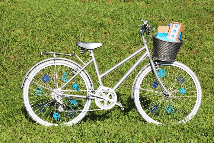
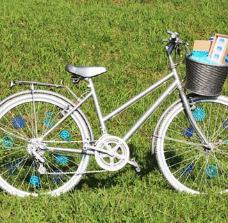
Sunny Hills is a brand known for its signature Taiwanese dessert — the pineapple cake — rooted in tradition yet full of potential for reinvention. In Taiwan’s agricultural history, bicycles were commonly used by farmers to transport pineapples, making the bicycle a symbolic link to this heritage. This project explores how we can reshape the traditional image of the pineapple cake industry through fresh color palettes and bold graphics, showing that a time-honored brand like Sunny Hills can stand out with a modern, distinctive identity.
Logo Design
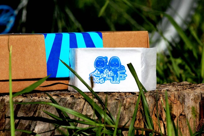
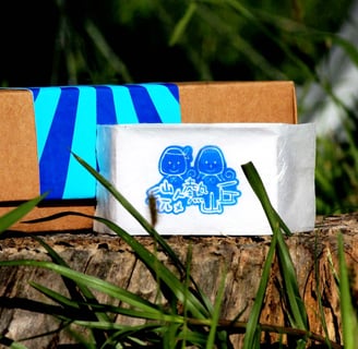
Sunny Hills Rebranding
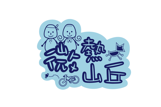
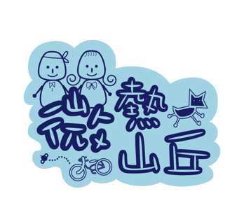
This playful logo reimagines Sunny Hills by blending traditional Taiwanese symbols with a fresh, modern style. Hand-drawn elements and a cool blue palette highlight the brand’s heritage while breaking from convention, showing that a classic like pineapple cake can feel youthful, creative, and uniquely Taiwanese.
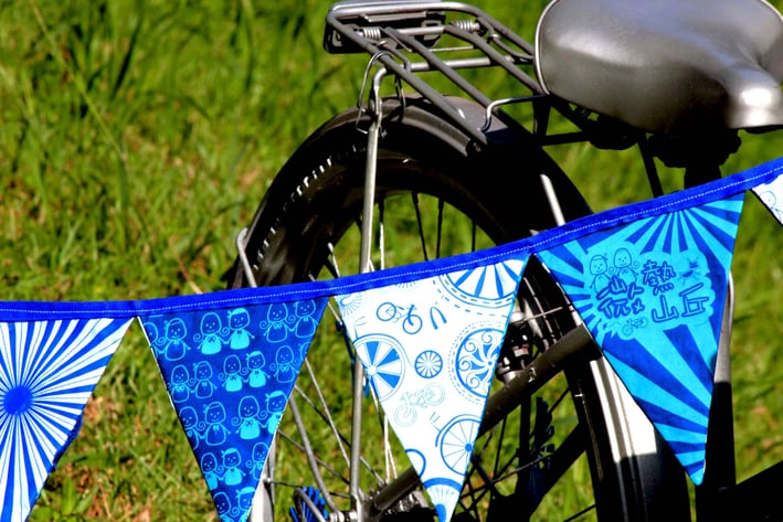
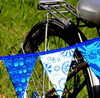
Pattern Design
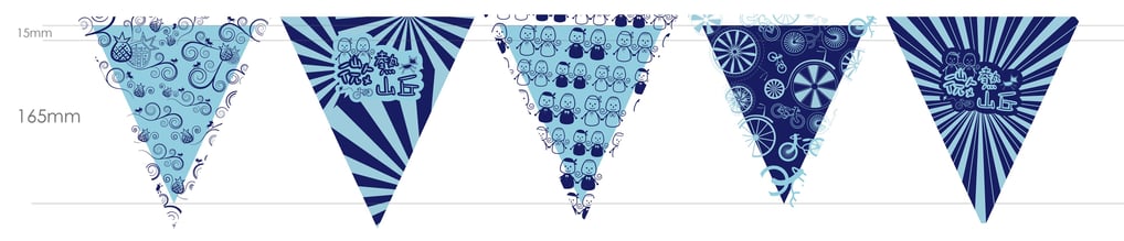
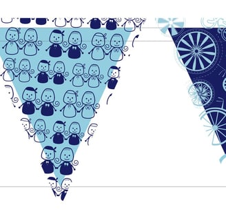
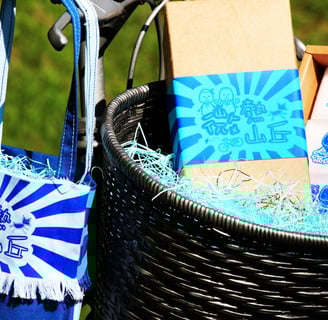
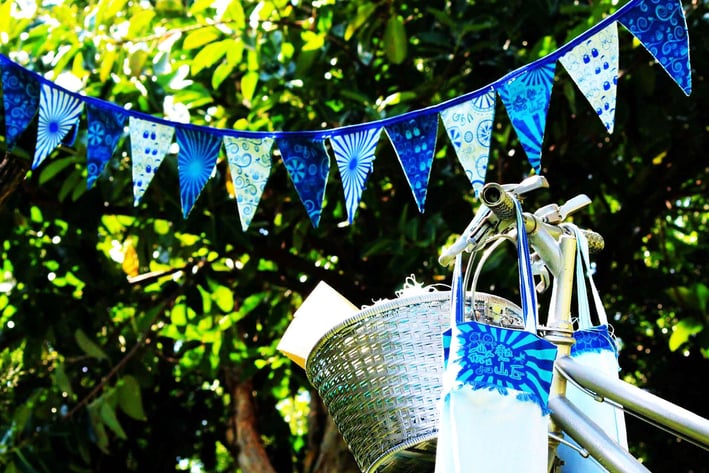
This design celebrates community spirit with playful icons, retro starbursts, and friendly cartoon characters. The blue palette feels cohesive and inviting. It’s perfect for events that blend nostalgia and energy, creating a vibe that’s equal parts wholesome and hype. Basically: instant good vibes on a string.
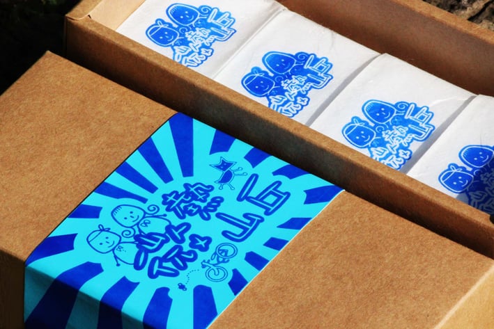
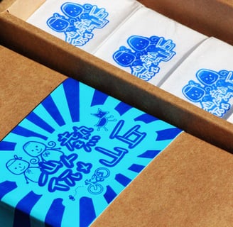
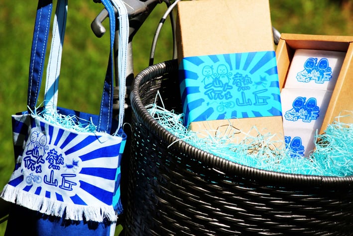
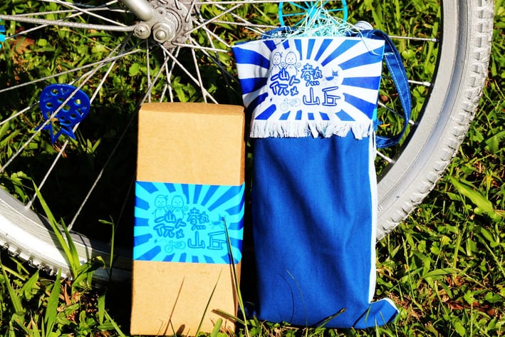
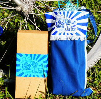
Packaging Design
This packaging design combines bold visuals with friendly, hand-drawn illustrations to create instant shelf appeal. The bright starburst rays radiate positivity and freshness, while the cute cartoon characters suggest warmth, community, and approachable quality.
The clean blue palette feels trustworthy and hygienic, perfectly balanced by the natural kraft box that grounds the look in an eco-friendly, down-to-earth feel.
Overall, it’s a design that makes everyday essentials feel a little more special—playful, reliable, and inviting. It reassures customers they’re choosing a product that cares about both practicality and cheerful design.