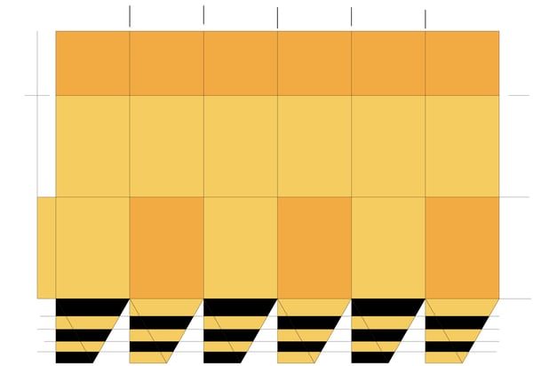
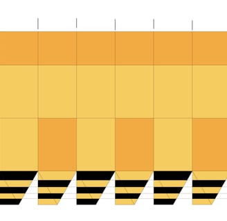
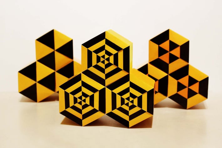
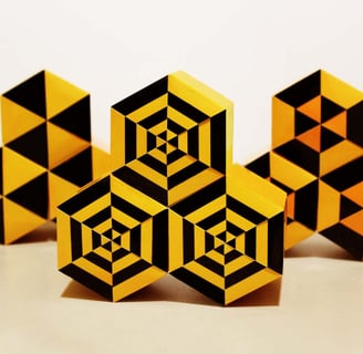
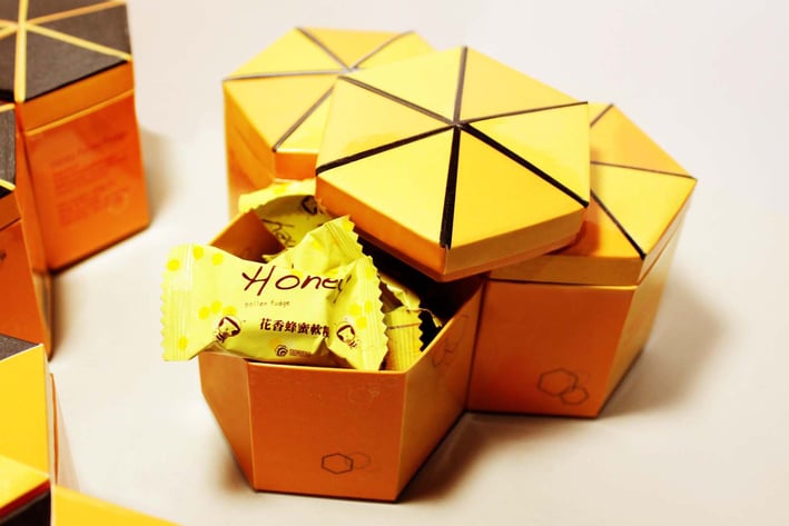
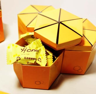
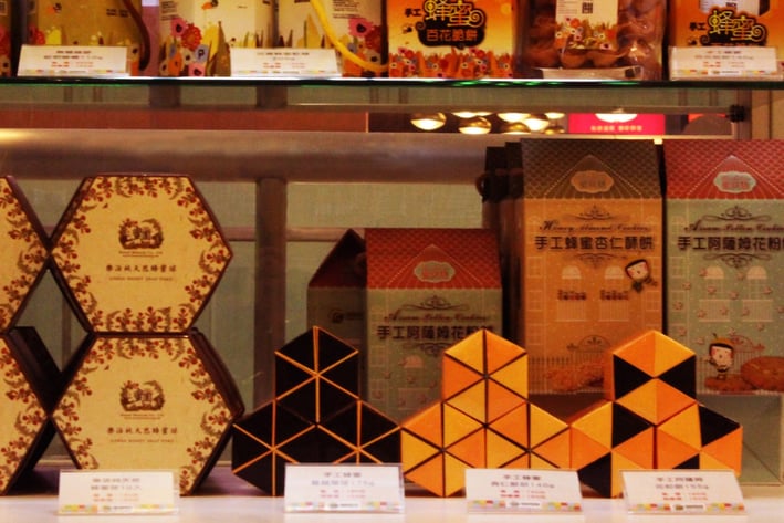
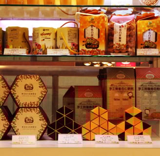
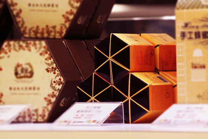
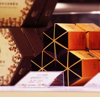
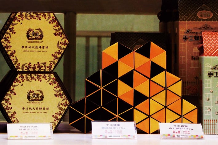
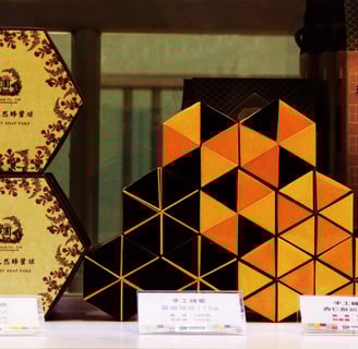
This packaging is inspired by the geometry of a beehive, using hexagonal shapes to instantly connect with honey and natural sweetness. The black and yellow palette directly references bees while also creating a bold, high-contrast look that commands attention.
The optical patterns give a contemporary twist to the classic hive, suggesting energy, craftsmanship, and the intricate work of bees. It feels modern but still rooted in nature—perfect for honey and candy products that are both authentic and exciting.
Honey Museum Rebranding
Packaging Design
This packaging design combines bold visuals with friendly, hand-drawn illustrations to create instant shelf appeal. The bright starburst rays radiate positivity and freshness, while the cute cartoon characters suggest warmth, community, and approachable quality.
The clean blue palette feels trustworthy and hygienic, perfectly balanced by the natural kraft box that grounds the look in an eco-friendly, down-to-earth feel.
Overall, it’s a design that makes everyday essentials feel a little more special—playful, reliable, and inviting. It reassures customers they’re choosing a product that cares about both practicality and cheerful design.