The Carrefour Packaging Guideline design establishes a cohesive visual identity across all product lines. It combines clear typography, consistent color palettes, and structured layouts to create a modern, recognizable look that builds trust with customers.
Carrefour Guideline
Logo Guideline
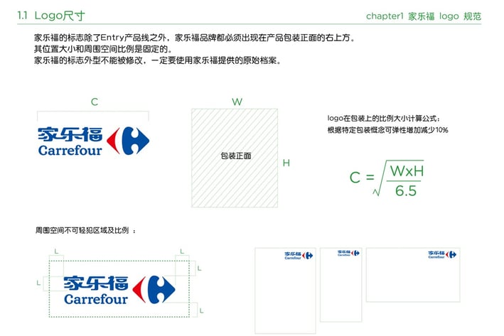
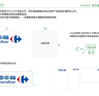
The Carrefour Logo Guideline defines precise rules for using the brand’s iconic emblem and wordmark. It details correct logo spacing, sizing, and color applications to ensure consistent visibility and impact across all platforms.
Packaging Guideline
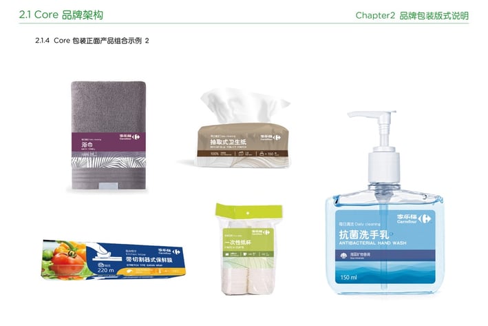
The guidelines prioritize legibility, shelf impact, and ease of navigation while accommodating diverse product categories, from fresh produce to household goods. Iconography and imagery are carefully curated to reflect Carrefour’s values of quality, affordability, and sustainability.
Packaging Mockups
This guideline empowers teams and partners to present a unified, professional image. By following these standards, every touchpoint reinforces Carrefour’s identity as a trusted, accessible, and contemporary brand leader in the retail space.